ShopDreamUp AI ArtDreamUp
Deviation Actions
Daily Deviation
Daily Deviation
January 30, 2010
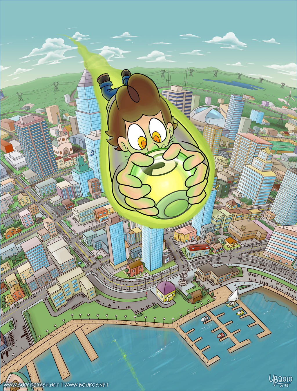
Aerial view by =TheBourgyman is simply too amazing for words. It is full of an insane amount of excruciating detail, from the power lines in the background to the fully detailed buildings, each drawn with many, many windows. We also get to experience what it feels like for a would-be superhero to fly for the very first time. I could think of a million things to say about it, but, it speaks for itself.
Featured by Thiefoworld
Suggested by StriderWG

Early Comics
3 Subscribers
Thanks for helping me keep making comics! you get to see the comics earlier (about 5 days earlier) and for every 6USD, you have the right to ask Rayah a wish!
$1/month


Suggested Deviants


Suggested Collections


You Might Like…


Featured in Groups


Description
This is an excerpt from the latest page of my Supercrash webcomic (which you can read here). I haven't submitted serious Supercrash art in a very long time, and since this is arguably one of the most technical and meticulous illustration I've made yet, why not grab the opportunity to break the ice with this one.
This illustration has a lot of small details, just hit the Download button at your left for a closer look!
Please visit www.supercrash.net for more Supercrash comics! It would also be awesome if you could take a minute to vote on this week's entry.
Took approximately 35-40 hours in Adobe Illustrator CS4 and Adobe Photoshop CS4 (though I lost count, really).
Fun fact: the original illustration size is 8235 x 10822 pixels. Also, the visible neighbourhood is based on a real part of my native town (the roads are real, though most of the buildings are not).
Enjoy!
Supercrash belongs to me.
This illustration has a lot of small details, just hit the Download button at your left for a closer look!
Please visit www.supercrash.net for more Supercrash comics! It would also be awesome if you could take a minute to vote on this week's entry.
Took approximately 35-40 hours in Adobe Illustrator CS4 and Adobe Photoshop CS4 (though I lost count, really).
Fun fact: the original illustration size is 8235 x 10822 pixels.
Enjoy!
Supercrash belongs to me.
Image size
2200x2900px 2.53 MB
© 2010 - 2024 TheBourgyman
Comments275
Join the community to add your comment. Already a deviant? Log In
This is a very nice excuse to get back into critiquing. Upon seeing this piece, I was immediately impressed. Its detail lures you in like a fly to a light bulb.
The most impressive feat of this is, of course, its virtually perfect perspective. I really like how it works with the curved surface. Second is the tremendous amount of detail, down to being able to see specific traffic signs. It really feels like a thriving place with a personality. A big plus is the green light reflected in the water. It really adds a great sense of height to the whole ordeal.
There are some things that I would've done differently, I mean, this is a critique, after all. The docks, as much of a fantastic addition they are, could use a small drop shadow to illustrate that they're above the water. Traffic is illustrated as black dots of cars and people, and while it adds to detail, the fact that it's all solid black makes it look more like the city is inhabited by ants. The solution is simple: choose a slightly less harsh color, such as a darker gray, so it blends a bit into the background.
One thing is for certain, this shows that Supercrash is a web comic with very high production values. If this doesn't make that abundantly clear, I wouldn't know what does.
As a closing remark, my decision to rate "originality" slightly lower has nothing to do with the Supercrash franchise, but rather the deviation on it's own.